

Mobile Responsive Websites in Clearwater, Safety Harbor, Tampa FL, and the Surrounding Areas
If you own a business or lead an organization in Clearwater, Safety Harbor, or Tampa, FL, having a website is only the beginning. The real question in 2025 is: Is your website mobile-friendly? If it’s not designed to look and function great on phones and tablets, you may be losing valuable visitors every single day.
With nearly 60% of all web traffic now coming from mobile devices, a desktop-only website is no longer enough. That’s why mobile responsive websites are essential for success online. A mobile-friendly website design not only improves the user experience but also helps your website rank better on Google, increases engagement, and ultimately supports your business goals.
 Many people in Clearwater, Safety Harbor, and Tampa have asked this question, even if in different ways. Maybe you’ve asked one of these questions yourself:
- What does mobile-friendly website design mean for my business?
- Why is a mobile responsive website important in 2024?
- How do I know if my website is mobile-friendly?
- Will my rankings on Google improve with a mobile-friendly design?
- Can I redesign my existing site to be mobile-responsive?
If any of these sound familiar, you’re not alone. In today’s mobile-first world, responsive design isn’t just a design trend — it’s a business necessity.
In This Article…
In this article, we’ll explain what mobile-friendly website design is, why it’s critical for businesses in the Clearwater area, and how mobile-responsive websites help you attract and retain customers across all types of devices.
What Is Mobile-Friendly Website Design?
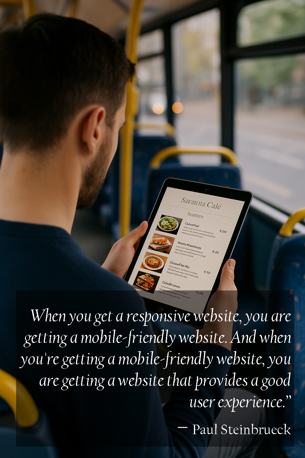
Mobile-friendly website design refers to the process of designing a website that works seamlessly across all screen sizes and devices. Whether a user visits your site on a smartphone, tablet, or desktop computer, the layout, content, and functionality should automatically adjust to provide a smooth browsing experience.
Responsive web design means building your site so it responds to or changes with the width of the screen that the visitor is using. In other words, the website automatically resizes and reorganizes its content based on screen size — without the user needing to zoom, scroll sideways, or navigate a broken layout.
A mobile-responsive website includes features like:
- Readable text without zooming
- Tap-friendly buttons and links
- Simple mobile navigation
- Fast load speeds on mobile networks
- Optimized forms and image display

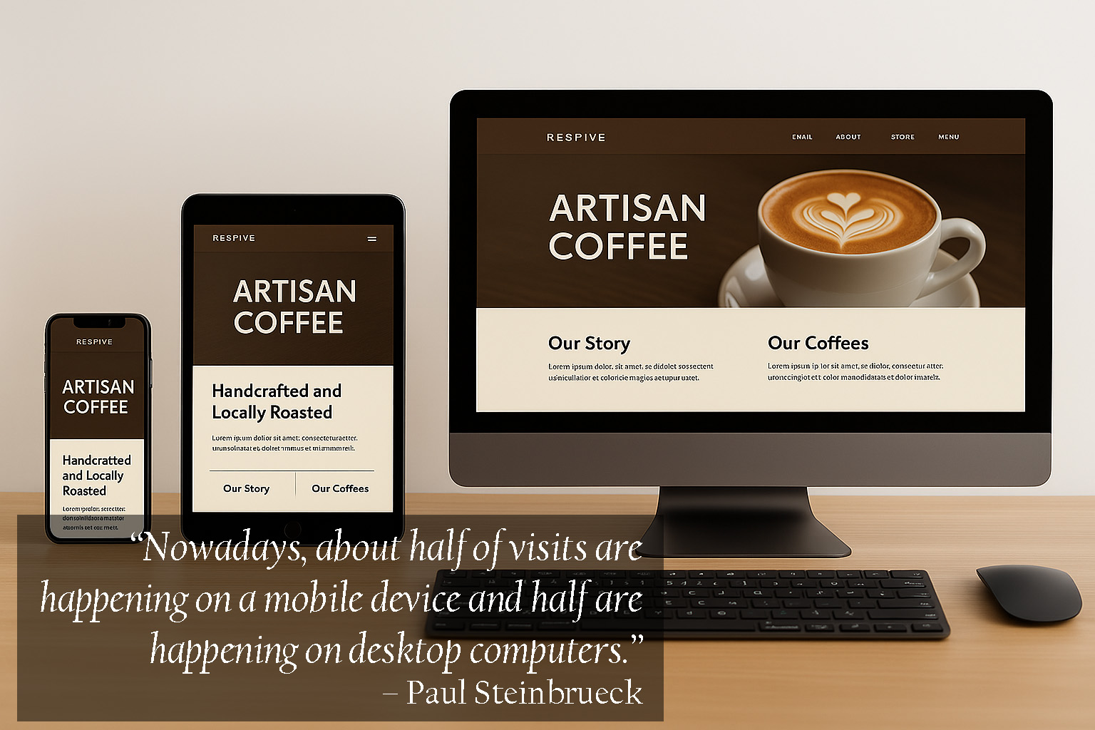
With a responsive design, your site provides a positive experience whether someone visits it from a desktop in Tampa, a tablet in Safety Harbor, or a phone in Clearwater.
Why Is a Mobile-Friendly Website So Important?
Having a mobile-friendly website is not just about design. It affects your visibility, your user experience, and your bottom line.
1. User Experience Matters
Today’s users expect a smooth experience — and they’re quick to leave if a website doesn’t deliver.
“85% of adults think that a company’s mobile website should be as good or better than their desktop version.”
— Sweor
If users have to zoom in, scroll horizontally, or struggle to navigate your site, they’re likely to bounce and head to a competitor instead.
2. Google Prioritizes Mobile-Friendly Sites
In 2019, Google officially switched to mobile-first indexing, which means the mobile version of your site is the primary version it evaluates for ranking purposes.
If your website isn’t mobile responsive, it may not rank well in search results — and that could seriously limit your visibility to potential customers in Clearwater and beyond.
3. Increased Conversion Rates
A mobile-optimized site makes it easier for users to take action, such as:
- Filling out a contact form
- Making a purchase
- Scheduling an appointment
- Clicking to call your business
When people can interact with your site easily on their phones, they’re more likely to convert.
4. Future-Proof Your Site
Device types and screen sizes are constantly evolving. From foldable phones to smartwatches, a responsive design ensures your website stays functional — no matter what device comes next.
How to Know If Your Website Is Mobile-Friendly
Not sure if your site is meeting today’s mobile standards? Here are a few quick ways to check:
- Visit your site on your phone and tablet
- Use Google’s Mobile-Friendly Test tool
- Check how fast your site loads on mobile networks
- Ask a few people to test it and share feedback
- Look at your bounce rate and engagement stats in Google Analytics
If your site is hard to navigate, slow to load, or looks strange on mobile, it may be time for an upgrade.
Mobile-Friendly Website Design Best Practices
If you’re building or redesigning your website, here are some mobile-friendly best practices to follow:
- Use a responsive layout that adjusts to any screen size
- Keep navigation menus simple and thumb-friendly
- Make sure buttons and CTAs are large enough to tap
- Choose readable font sizes and spacing
- Optimize image sizes for mobile speed
- Minimize pop-ups or intrusive elements
These elements work together to create a positive mobile experience that encourages users to stay on your site longer and take action.
Why Choose a Mobile-Friendly Website Design Company in Clearwater, Safety Harbor, or Tampa?
If you live in Clearwater, Safety Harbor, Tampa FL or the surrounding areas and you are looking for a mobile-friendly website design company, contact us.
We provide mobile responsive website services to help you succeed in your business and mission.

Skyway Website Design and Marketing Services
A mobile-friendly website design agency serving Clearwater, Safety Harbor, Tampa FL, and the surrounding areas.
Contact us today for mobile responsive website services.

President at Skyway Web Design & Marketing
Mark has served as the President of Skyway Web Design & Marketing since its founding and has lived in the Tampa area for most of his life.
In his role, Mark oversees the Custom Website and Sales departments, bringing expertise to hundreds of custom website, graphic design, and marketing projects for businesses, churches, non-profits, and schools.
Beyond his professional work, Mark is deeply involved in his community, coordinating and packing over 700 meals each week for children through One Community Now’s Pack A Sack for Kids program.